
Have you ever left an online shop irritated because you couldn’t locate what you were searching for?
Most folks do. You go to the shop with a certain purpose in mind. Maybe you’re looking for jogging sneakers, a laptop sleeve, or a new coffee grinder. You enter something in the search bar. Scroll. Select a few filters. Open a few product pages. Then something unusual occurs.
You stopped caring. Not because the retailer does not have the item. It probably does. You can’t locate it quickly enough to keep motivated.
I’ve seen this happen several times. Not in research papers or conference presentations, but in everyday life. Friends shop on their phones during lunch breaks. Colleagues are looking for alternative equipment. Family members attempt to purchase presents before a birthday. The trend is consistent: if discovery is difficult, people quit.
The interesting thing is that most eCommerce firms put a lot of work into gaining traffic to their websites. Ads. Social campaigning. Email promotions. However, many businesses lose consumers just as they are about to make a purchase. That’s where product discovery softly transforms everything.
Businesses that focus on improving eCommerce SEO often create better category structures, optimized product pages, and intuitive navigation that help both shoppers and search engines discover products more efficiently.
Difference Between Browsing and Finding
A few years ago, I assisted in the assessment of an online fashion company. Traffic was not the issue. Product quality was not an issue either. The difficulty was navigation.
A well-planned website architecture is a key element in building high-converting online stores, ensuring customers can move effortlessly from browsing to purchasing.
The shop offered hundreds of different apparel items. Different hues. Different fabrics. Different fits. Customers often open many product pages to evaluate basic alternatives. The procedure felt like an effort.
Something unusual occurred when we improved the tools for product discovery. Visitors spend less time looking, yet purchase more often. At first glance, this seems conflicting. Shouldn’t it be preferable to have longer sessions? Not necessarily.
A consumer who discovers the right product in three minutes is more likely to have a positive experience than someone who spends twenty minutes browsing. Efficiency boosts confidence. Confidence leads to purchases.
People don’t go to shops because they love looking through endless menus. They come because they seek answers.
Small Frictions Create Big Problems
One of the most common errors that internet retailers make is underestimating minor frustrations. Imagine someone looking for a black leather backpack.
They use a color filter. Nothing occurs. They rejuvenate. Try again. Still nothing. Now they’re asking whether the business genuinely offers black backpacks. Uncertainty is important.
Every additional click, perplexing category, or disorganized filter raises skepticism. And doubt is costly. Customers seldom express their dissatisfaction. They vanish.
Analytics systems often demonstrate this plainly. Visitors bounce from category pages. Search frequently—exit after seeing just a few goods. The items themselves may be wonderful. The route to them isn’t. That’s the difference that many companies overlook.
Discovery Shapes Perception
People often rely on their evaluation of a store’s quality on how simple it is to discover things. not the genuine items. The experience of others around them.
Consider strolling into an actual retail business. If things are dispersed indiscriminately, shelves are unorganized, and employees are unable to answer simple queries, you will likely conclude that the firm is poorly managed.
Online buyers make similar assumptions. A complicated website conveys the image of a confusing firm.
On the other side, when categories are sensible, filters operate effectively, and suggestions make sense, visitors automatically trust the business more. Trust is not always established via a message. It may be constructed via navigation.
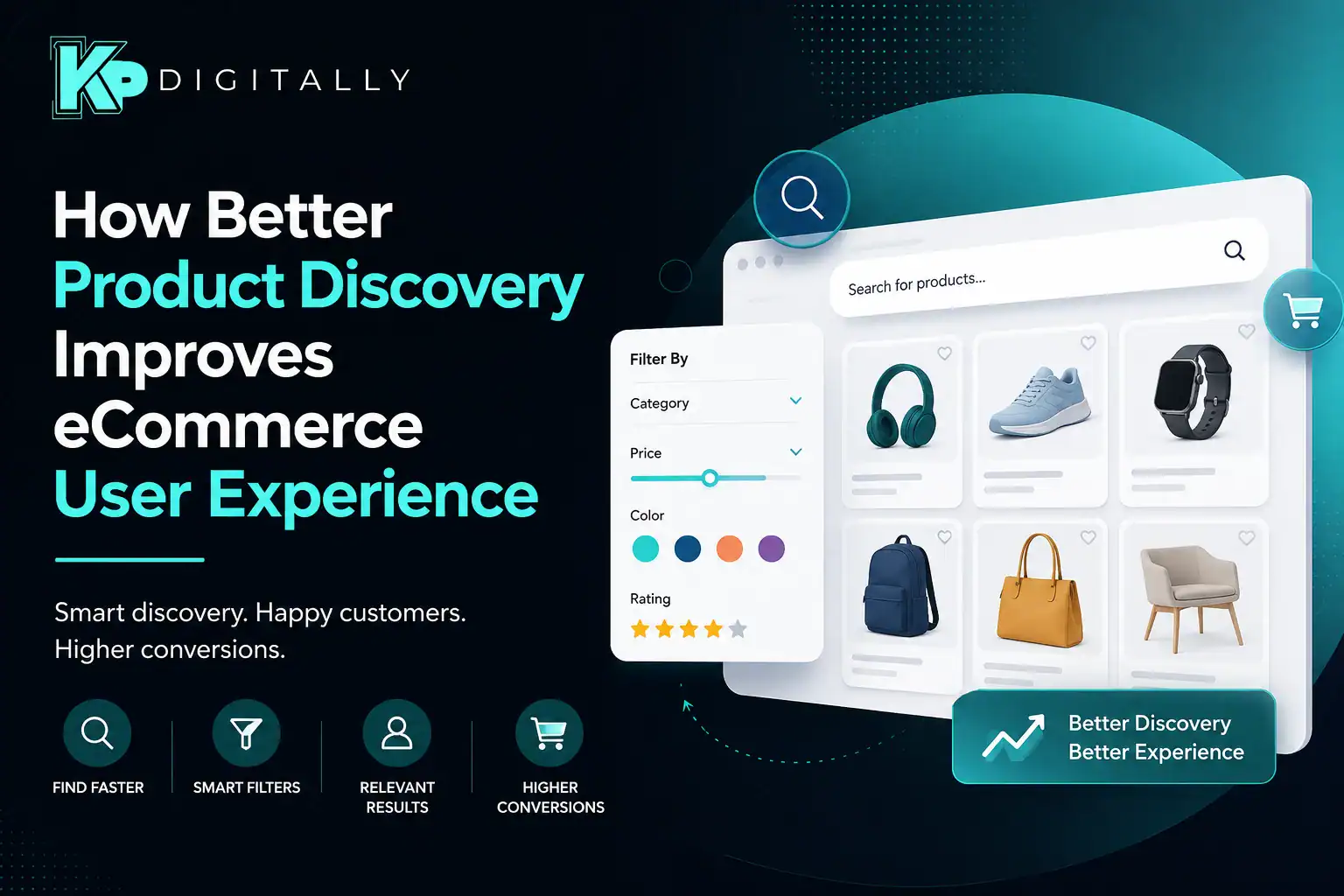
Why Visual Discovery Matters More Than Ever
Modern customers digest visual information quite quickly. They do not always read. They scan. This is particularly true in industries such as fashion, cosmetics, furniture, technology, and home decor.
Consider someone shopping for a t-shirt that comes in ten different colors. Would they prefer to read a dropdown menu with every color name? Or can you see each choice visually?
The solution is apparent. Visual selection tools need less cognitive effort. Customers do not need to visualize items. They can see them.
That’s why tools like attribute swatches have grown so popular in successful online retailers. They assist visitors in understanding alternatives quickly rather than requiring them to analyze text-based decisions.
Immediate comprehension decreases hesitancy. Many purchase choices are made in a matter of seconds.
Hidden Cost of Choice Overload
More items do not inevitably result in a better shopping experience. Sometimes they do the reverse. I’ve seen businesses boldly display thousands of things, unwittingly overwhelming customers.
A consumer looking for a desk light does not want 900 results that are only distantly connected. They want the correct light. Fast. The issue isn’t inventory size. It’s relevant.
Strong product discovery systems intelligently filter down the available options. They direct customers toward potential matches without making them feel confined. That is a fine balance.
Excessive choices cause tiredness. Too few leads to dissatisfaction. The greatest shops are discreetly situated midway in the center.
Search Should Feel Like a Conversation
Consider how people really search. They aren’t always exact. Someone may write “blue running shoes.” Alternatively, “Comfortable shoes for bad knees”
Or just “gym shoes”. Three separate searches. Potentially the same objective. However, many retail search engines continue to treat buyers as if they must use exact product language. That is unrealistic.
Good product discovery recognizes intent rather than simply keywords. It predicts errors. Corrects misspellings. Suggests alternatives. When search seems natural, customers scarcely notice it. That is generally an indication that something is functioning.
Product Variations Can Make or Break the Experience
Product differences provide an intriguing challenge. Customers like choices. There are a lot of them. Different hues. Various materials. Various sizes. Various combinations. However, poorly presented alternatives may transform a simple transaction into a difficult problem.
I recently saw someone browse for a couch online. Every fabric variety was shown as a distinct product page. Each color needed extra loading. Every comparison required opening a new tab. After 10 minutes, they gave up. Not because they despised the couch. Because the procedure seemed tiring.
This is why tools such as a WooCommerce variation swatches plugin have become popular among merchants looking to simplify selection experiences. Instead of burying choices behind dropdown menus, they make variations easier to understand and compare. The improvement sounds small. For shoppers, it rarely feels small.
Recommendations Work Best When They Feel Helpful
We’ve all received poor recommendations. When you buy a camera, every page immediately displays twenty additional cameras. Not really beneficial. Effective suggestions act differently. They have a human-like quality.
Moisture-wicking socks, trail backpacks, and waterproof outerwear may appeal to a hiking footwear buyer. These proposals make sense. They are contextual.
Relevant suggestions increase discovery by directing buyers to things they were unaware they required. The experience seems more led than forced. That is a key difference. People like finding valuable things. They despise feeling
Mobile Shopping Raises the Stakes
When using mobile devices, the difficulties associated with product finding become much more apparent. Everything on the screen vanishes. There is a decrease in attention spans. There is a loss of patience.
A problem with navigation that seems to be very trivial on a desktop computer might become a significant barrier when seen on a mobile device. I have seen customers leaving establishments for no other reason than the fact that filter menus were difficult to shut off. That’s right.
Something so tiny. Mobile consumers anticipate having clarity. They anticipate rapidity. They anticipate receiving visual signals that will assist them in moving through a catalog more quickly.
It is common for features such as attribute swatches to become even more beneficial on smaller displays since they lessen the amount of wasteful tapping and page flipping that occurs. Use less effort.
Best Discovery Experiences Feel Invisible
When it comes to product discovery, one of the most remarkable aspects is the fact that buyers hardly ever openly commend the product. No one ever leaves a comment on the internet stating, “Wow, those filters worked perfectly.”
On the other hand, successful discovery is a factor in almost every other favorable result. A greater number of conversions. Higher rates of client retention. Increasing the number of repeat purchases. The reputation of the brand improved.
One of the ironies of success is that it often goes unappreciated since the experience is so naturally easy. Creating experiences that are effortless is a surprisingly challenging endeavor.
Customers are not interested in learning how a website operates, which is something that the shops that get it right understand at a basic level. They would want the internet to comprehend the manner in which they buy.
Conclusion
It is not enough to have a spectacular design in order to have great eCommerce experiences. It is via thousands of seemingly little choices that consumers are able to go from a state of curiosity to one of self-assurance. The discovery of the product is the most important part of that trip.
Shoppers will have a different experience overall if they are able to rapidly identify items that are relevant to their needs, readily compare available alternatives, investigate useful suggestions, and navigate without encountering any friction. They have a sense of being understood. They have a sense of being directed. Most significantly, people have a sense of ease while making purchases.
The successful shops are not always the ones that have the most extensive catalogs or the most substantial marketing expenditures. They are often the ones who make the process of locating the appropriate goods seem remarkably simple.
In the realm of electronic commerce, this is a competitive edge that people notice, even if they are unaware that they are even seeing it.